Plots, Graphs, and Curves in the World of Linux
By Ben Okopnik
Making the Choice
Most people have trouble visualizing the meaning of lists or tables of numerical data; unless you're an engineer working in a familiar field, a mathematician used to interpreting matrices, or just plain have the knack for it, groups of numbers hold little obvious information. However - given that ~80% of us are visually-oriented in terms of how we best accept information - graphs, when properly chosen and presented, bring that same data across in a way that is much easier to comprehend.As is very common with Linux, particularly in anything related to science, there's not just one program to do graphs - there's a large list. A quick scan of the Debian database returns 95 matches for "plot"; not all of these are plotting utilities, but limiting the list to those that have "plot" or "graph" in the program definition (rather than the full description) only shrinks the list to 57. For myself, I experimented with a few of them - I was looking for something that was not restricted to a specific application or field, but was a general-purpose plotting program - and quickly settled on gnuplot.
Taking Those First Steps
The initial stage, i.e., learning gnuplot syntax, was surprisingly easy: the syntax is sensible and structured in such a way that it generally follows the construction of English. Obviously, there are breaks in that model - English can be ambiguous, and that is one thing that a computer language cannot be - but in general, the commands make sense. As well, the built-in help of gnuplot is a life-saver: you can type "help <command>" at a prompt, and you'll see the complete syntax for that command as well as an explanation of what it does, including sub-topical help for each option of the command. This, by the way, is one of the best textual help systems I've seen in any program.The URLs and file locations for the gnuplot FAQ and manual can be found at the end of this article. However, I found that simply experimenting with it for about half an hour let me produce usable results and accomplish what I wanted the first time; later, when I had more time to spare, I spent a total of about three hours learning it to the point where I felt reasonably comfortable with it. Despite having used it a fair number of times since then, I am by no means an expert - but I find it very useful nonetheless.
Producing Your First Plot
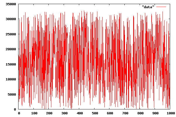
If you have a body of data, such as - let's say - a list of 1,000 randomly-generated numbers arranged one per line (gnuplot can use other layouts; however, this would require using additional syntax), generating a plot is very easy, and can actually be done right from the shell prompt:echo 'plot "data"; pause 10'|gnuplot

gnuplot will now display your data - after automatically computing
the X and Y ranges, one based on the count of elements and the other on
your values - and show the data points as small red crosses for 10 seconds.
Conversely, you could just type gnuplot at the command line,
then enter plot "data" at the prompt (no pause is necessary -
the image will stay up until you press 'q' to quit.)
However, most people want to do more than just show points on a field. What about a line graph?
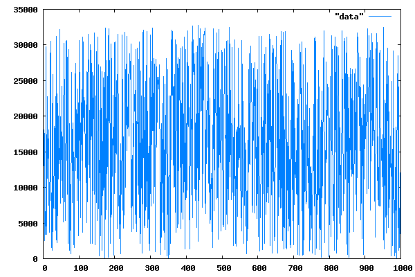
echo 'plot "data" with lines; pause 10'|gnuplot

Red is boring. How about plotting it in blue?
echo 'plot "data" with lines 3; pause 10'|gnuplot

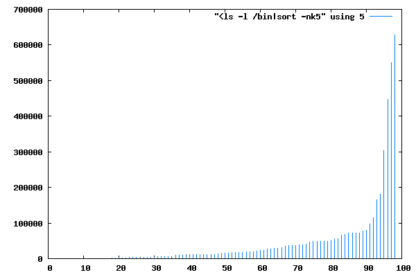
How about plotting the range of sorted file sizes in a directory, with a separate line showing the magnitude of each datapoint? Sure, we can do that too - although the "filename" parameter will now be a bit special (note the preceding < in it; this creates a pipe from the output of the specified program that gnuplot will read as the data input):
echo 'plot "<ls -l /bin|sort -nk5" using 5 with impulses 3; pause 10'|gnuplot

Since file size is the 5th column in the output of "ls -l", I've specified that gnuplot should be 'using' that column.
So far, so good; we've managed to do some useful work at the command line. Obviously, though, there are many complex tasks that we might want to perform with our plotting software - and one-line commands don't preserve our work. Fortunately, gnuplot supports script files; more than that, that's what it expects to read when you invoke it with a filename.
Saving Your Work
Unix FAQ #3,229: "So, what's the difference between a script and a program?"A script is what you give the actors. A program is what you give the audience. -- Larry Wall, the creator of Perl
Creating a gnuplot script requires nothing more than opening a
text file and entering the desired commands. Just like in a shell script,
the commands may be separated by newlines or semicolons; the two are
equivalent. Also, note that you can abbreviate the gnuplot commands
as long as you keep them unambiguous; p "data" w p is
the same as plot "data" with points (don't do this if
somebody else will be reading your script, however; be kind and make the
syntax at least somewhat readable.) I like to name these scripts with a
".plt" extension so that when I hit 'Enter' on one of them in Midnight
Commander, it's automatically loaded into gnuplot (I've set up a
stanza in the MC preferences which does just that), but there's no
requirement of that sort from gnuplot itself.
Let's start with a script that I used just a little while ago to demonstrate graph creation to one of our recent authors (he had mentioned that his graph file sizes either came out too large or the labels became too small and fuzzy to read.) Note that the data I'm using is purely arbitrary and has no relation to his article - I've just picked some random numbers.
Since I want the plot to be saved as an image file, there are two things I have to set first: the terminal (i.e., the type of output, set to 'x11' by default) and the output (set to STDOUT by default.) There's a very large range of terminal options - gnuplot supports a multitude of output formats - but since we're interested in a small file size and are dealing with large color blocks, this makes the PNG format perfect for our purposes. Note that, in keeping with my original purpose of creating a graph for publication in the Linux Gazette, I've set the size to the maximum image width we accept - 600 pixels, even if the resulting images look too large for the purpose. As for the output, I'm going to give it the same filename as I did to the plot, except the extension is now ".png" instead of ".plt".
set terminal png size 600, 400
set output 'gnuplot-hor.png'
unset xtics
set ytics
set x2tics ( "XFS" 0, "JFS" 1, "JFFS" 2, "ReiserFS" 3, "ext3" 4 )
set xrange [ -0.5:4.5 ]
set boxwidth 1
set style fill solid border -1
set label "Deleting 10,000 files" at graph .05, .9
plot "-" notitle with boxes fill, \
     "-" notitle with boxes fill, \
     "-" notitle with boxes fill, \
     "-" notitle with boxes fill, \
     "-" notitle with boxes fill
0 22
e
1 11
e
2 37
e
3 21
e
4 25
e
! any2png
Next, I'm going to unset the default X tick marks and their associated values - I want that side of the graph to be empty - and I'm going to set the "x2tics" (ticks on the opposite side of the graph) to the labels I want: "XFS" where the 0 would normally be shown, "JFS" at 1, and so on. Next, I define the X range: each of the 5 bars I'm going to draw is 1 unit wide with the first one centered on 0 and the last one on 4, which means that I want the display to begin at -0.5 and end at 4.5. I could, of course, shift the bar positions to whole numbers - but then the labels would line up at the half-way positions.
Now, for a little prettying up: I want a black border around the bars, and the bars themselves should be nice and wide - I'll set them to 1 unit. A little more style setting, then a descriptive label set at a position where it won't interfere with anything, et voila - we're ready to plot our data!
But wait! Where's our data set? Well, since I want a range of colored bars, I'm going to have to make an individual plot for each one (since they're successive plots, gnuplot will color them by progressing through its color range sequentially - although I could have set the colors explicitly.) This is how you would normally do a comparison of several data files; however, here we're plotting only one data point apiece - so I've decided to include that data right in the script file. Specifying five separate data sources seems like it would be a lot of work... but not with gnuplot. All we have to do is specify the "filename" as "-", meaning standard input, then follow it with the X and Y data terminated by an 'e' (end) marker. As well, the "plot" command can handle multiple plots all at once - so that's what I've done here.
Last, I ask gnuplot to execute a shell command by preceding it with a '!'; in this case, I want to run the "any2png" script (available on the Net; my tweaked version is located here), which squeezes PNGs down to their minimum size. As a result, I end up with this graph - at a file size of 1354 bytes, with crisp edges and no "jaggies" or fuzziness in the letters. By comparison, the originals were all in the 20kB range.

Actually, this isn't exactly the type of graph that the author had originally presented; his had horizontal bars and a vertical layout. Well, fair enough - we can do this too, even though it requires a little extra juggling:
set term png size 800, 600
set output 'gnuplot-vert.png'
unset xtics
set ytics rotate
set x2tics rotate ( "XFS" 0, "JFS" 1, "JFFS" 2, "ReiserFS" 3, "ext3" 4 )
set xrange [ -0.5:4.5 ]
set boxwidth 1
set style fill solid border -1
set label "Deleting 10,000 files" at graph .05, .5 rotate
plot "-" notitle with boxes fill, \
     "-" notitle with boxes fill, \
     "-" notitle with boxes fill, \
     "-" notitle with boxes fill, \
     "-" notitle with boxes fill
0 22
e
1 11
e
2 37
e
3 21
e
4 25
e
! convert -rotate 90 gnuplot-vert.png gnuplot-vert2.png
! any2png
! mv gnuplot-vert2.png gnuplot-vert.png

The differences all come from the "rotate" keywords used in several of the commands and the final use of "convert" to rotate the entire plot. The file size in this case came out a little smaller yet - 1332 bytes - and the script itself isn't any more complicated or difficult.
Look, Dorothy - it's the Emerald City!

If you've never had a chance to play with a 3-dimensional graph - I'm talking about having the ability to rotate it, shrink or expand it, zoom in or out, or any combination of the above - you're in for a pleasant shock. Here's a simple and cute 3D plot of the above function; go ahead and launch it. You can just start gnuplot, copy the script from the screen and paste it at the prompt.
set xrange [-pi/2:pi/2]; set yrange [-pi/2:pi/2]
set contour
set isosamples 100,100; set samples 100,100
splot sin(x)*cos(y) with lines palette linewidth 4
pause -1
Now, place your cursor over the plot and hold down your left mouse button. Move it around. Now, try your middle button; slide the mouse up and down as well as from side to side while pressing it. Nice, isn't it? The 'x11' terminal supports all of that, plus a large range of command line options. When you install the gnuplot-x11 package, that terminal becomes the default output method for gnuplot. The 'q' key will quit; 'h' will show you (on the text terminal) the other keys available during the display.
Last But Not Least
The material I've covered above has been a bare-bones introduction to gnuplot; the program is much more flexible, capable, and powerful than what I've discussed. In the world of Linux, the more tools you have in yor toolbox, the better off you are - and the more capable you are of performing a wide range of tasks. Given that visual methods are a large part of how we humans communicate, I believe that gnuplot should definitely be a part of everyone's standard toolbox.References
Packages to install:gnuplot gnuplot-doc gnuplot-x11Information:
man pages for all of the above
Typing "help" at the gnuplot prompt
FAQ:     /usr/share/doc/gnuplot/FAQ.gz
Manual: /usr/share/doc/gnuplot-doc/gnuplot.html
/usr/share/doc/gnuplot-doc contains a number of other informative files, particularly for those who want to use the PostScript terminal capability of gnuplot.
Web Resources:
The original gnuplot FAQ
The Not-So-FAQ
Tutorials, other gnuplot information
Ben was born in Moscow, Russia in 1962. He became interested in electricity
at the tender age of six, promptly demonstrated it by sticking a fork into
a socket and starting a fire, and has been falling down technological
mineshafts ever since. He has been working with computers since the Elder
Days, when they had to be built by soldering parts onto printed circuit
boards and programs had to fit into 4k of memory. He would gladly pay good
money to any psychologist who can cure him of the recurrent nightmares.
His subsequent experiences include creating software in nearly a dozen
languages, network and database maintenance during the approach of a
hurricane, and writing articles for publications ranging from sailing
magazines to technological journals. After a seven-year Atlantic/Caribbean
cruise under sail and passages up and down the East coast of the US, he is
currently anchored in St. Augustine, Florida. He works as a technical
instructor for Sun Microsystems and a private Open Source consultant/Web
developer. His current set of hobbies includes flying, yoga, martial arts,
motorcycles, writing, and Roman history; his Palm Pilot is crammed full of
alarms, many of which contain exclamation points.
He has been working with Linux since 1997, and credits it with his complete
loss of interest in waging nuclear warfare on parts of the Pacific Northwest.
 Ben is the Editor-in-Chief for Linux Gazette and a member of The Answer Gang.

